Fun with bookmarklets and CSS3 transforms
Posted Thu, Nov 26, 2009 in:I recently read about the CSS transform property, and I was inspired to give it a try in a fun and mostly useless way.
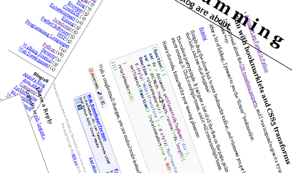
After a bit of fidding, I present to you the “Rotate!” bookmarklet (click it several times if it doesn’t work the first time):
Simply drag the above link to your bookmarks toolbar, and whenever you get bored with a webpage, click that link, and see what happens!
The code is pretty simple. It just gets a list of all the divs on the page, picks one of them at random, and starts rotating it. Click it multiple times, and it will rotate multiple times.
Here’s the code, formatted for your viewing pleasure:
    (function() {
      var ds = document.getElementsByTagName('div');
      var d = ds[Math.round(Math.random()*ds.length)];
      function rotateHeaders(r) {
        d.style['WebkitTransform'] = d.style['MozTransform'] = 'rotate(' + r + 'deg)';
        setTimeout(function() {rotateHeaders(++r % 360);}, 100);
      }
      rotateHeaders(1);
    })()
Unfortuneately, this only works in Firefox and Webkit-based browsers at the moment..wait, no, that’s pretty much ok. You IE folks out there are used to things not working in your browser by now.
With a couple small changes, you can make it scale instead: Scale!
